Building Trust Before Initial Interview
Talemy
·
2023
Role
UX & UI Designer
Timeline
3 months
June to August 2023
Team
4 members
Tools
Figma
FigJam
Framer
Problem
We Were Getting Applications. None of Them Fit.
Talemy is an human resources consulting startup that expanded from headhunting into a extensive consulting offering in its second year - and needed to grow the team to match. With around 7 full-time employees, almost all Gen Z, the goal wasn't to hire broadly. It was to attract a specific type of person: self-driven, values-aligned, and capable of operating in a consulting environment without close management.
The problem was the brand didn't have the market presence to pull that off yet. Applications were coming in, but none of them fit. And the tension made it harder, consulting reads as unreachable and corporate, which pushes promising Gen Z candidates away, but leaning too casual risks looking immature.
How Might We
How might we attract the right Gen Z candidates without losing credibility or blending into the crowd?
Research
Gen Z Does Their Research. So Did We.
Most of the research was secondary, working within a startup budget. The process ran in three steps:
01
Thao Bui led the desk research
conducting secondary research into Gen Z behavior and job-seeking patterns in Vietnam, then presenting the findings to the design team
02
I took those insights to internal employee
asking the HR team and existing Taleminions the same questions to see where Talemy's reality matched what Gen Z said they wanted
03
We mapped the overlap
identifying where Talemy was already strong and where we needed to build proof, then using that to shape what the career section communicated
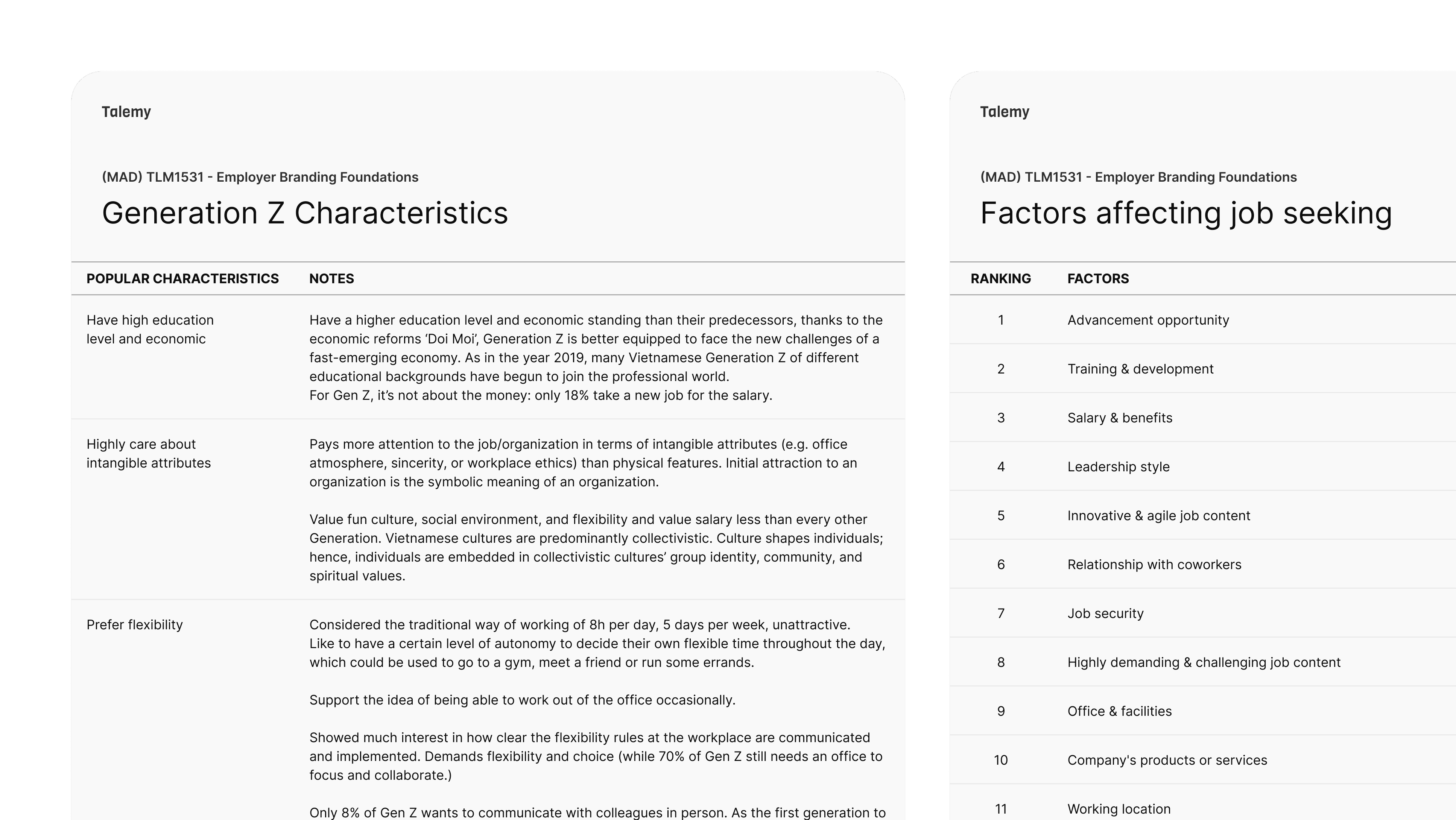
What the external research told us:
Top factors affecting Gen Z job-seeking.
Advancement opportunity
Training and development
Salary and benefits
Workplace culture and atmosphere
Sincerity and authenticity of the employer
Intangible attributes ranked significantly above physical ones. Flexibility was read as a trust signal - whether a company communicated its policies clearly indicated how much it respected its people.
What the internal interviews confirmed:
Where the external rankings and internal feedback overlapped, we had something worth showcasing. Where they matched, we designed around it. The satisfaction survey consistently surfaced:
Team dynamics and mutual support
Room to grow and take on new challenges
Psychological safety - freedom to express without judgment
The insight that shaped everything: Gen Z researches employers thoroughly before applying, and they can detect manufactured content. Authenticity wasn't a tone of voice decision - it was a structural one. The career section needed to show evidence, not just make claims.
Strategy
The Employer Brand Framework Was Already Answering Our Questions.
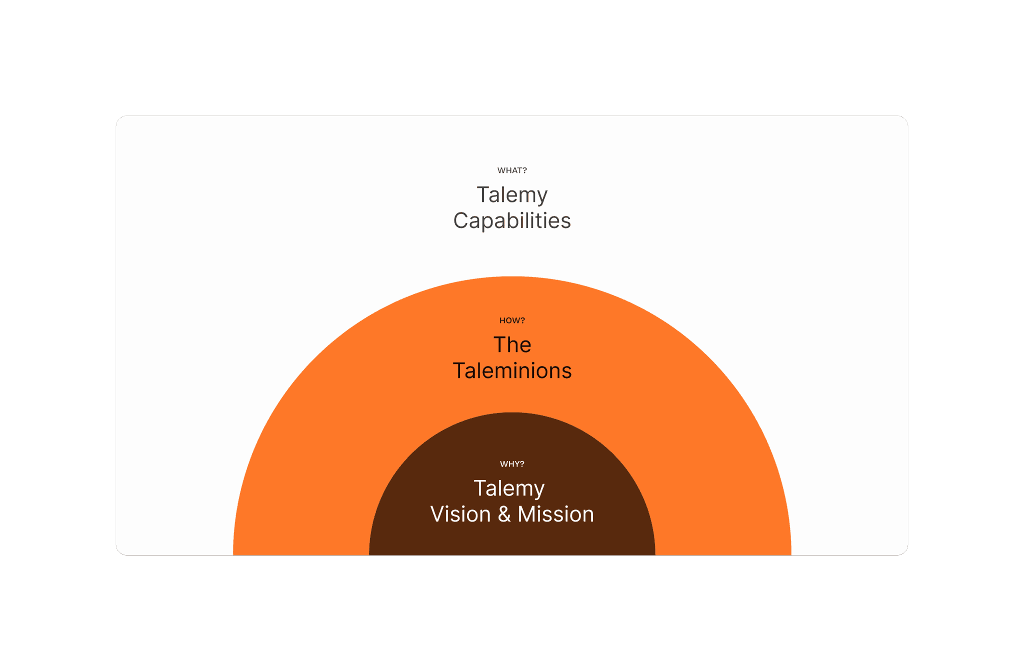
The Talemy Employer Brand Framework was being developed in parallel with this project and it wasn't built in isolation from the digital work. Every element of the framework was tailored to also function online, capturing the specific intentions we wanted to communicate on the career pages. Rather than translating a brand document into a website, the framework and the career section were shaped together.
Reliability as a core
Root strengths: People, Knowledge, Growth
Taleminion values: Accountable, Curious, Tenacious
Target archetypes: Dreamers (strategic thinkers), Talemakers (execution-focused), Taleminers (growth and opportunity-driven)
The framework became the filter for every content and structural decision in the career section. The question wasn't "what should we say?" - it was "what do we need to show to make this believable?"
Information Architecture
We Mapped Everything Out, Then Cut What Didn't Earn Its Place.
A single careers landing page wouldn't work for an audience that researches before applying. To figure out what the sub-site needed to contain, we ran a brainstorming session, sticky notes, open discussion, prioritisation. A lot of ideas went up. A lot got crossed out. What remained was a structure where every page had a clear job: substantiate one specific claim about what it's like to work at Talemy.
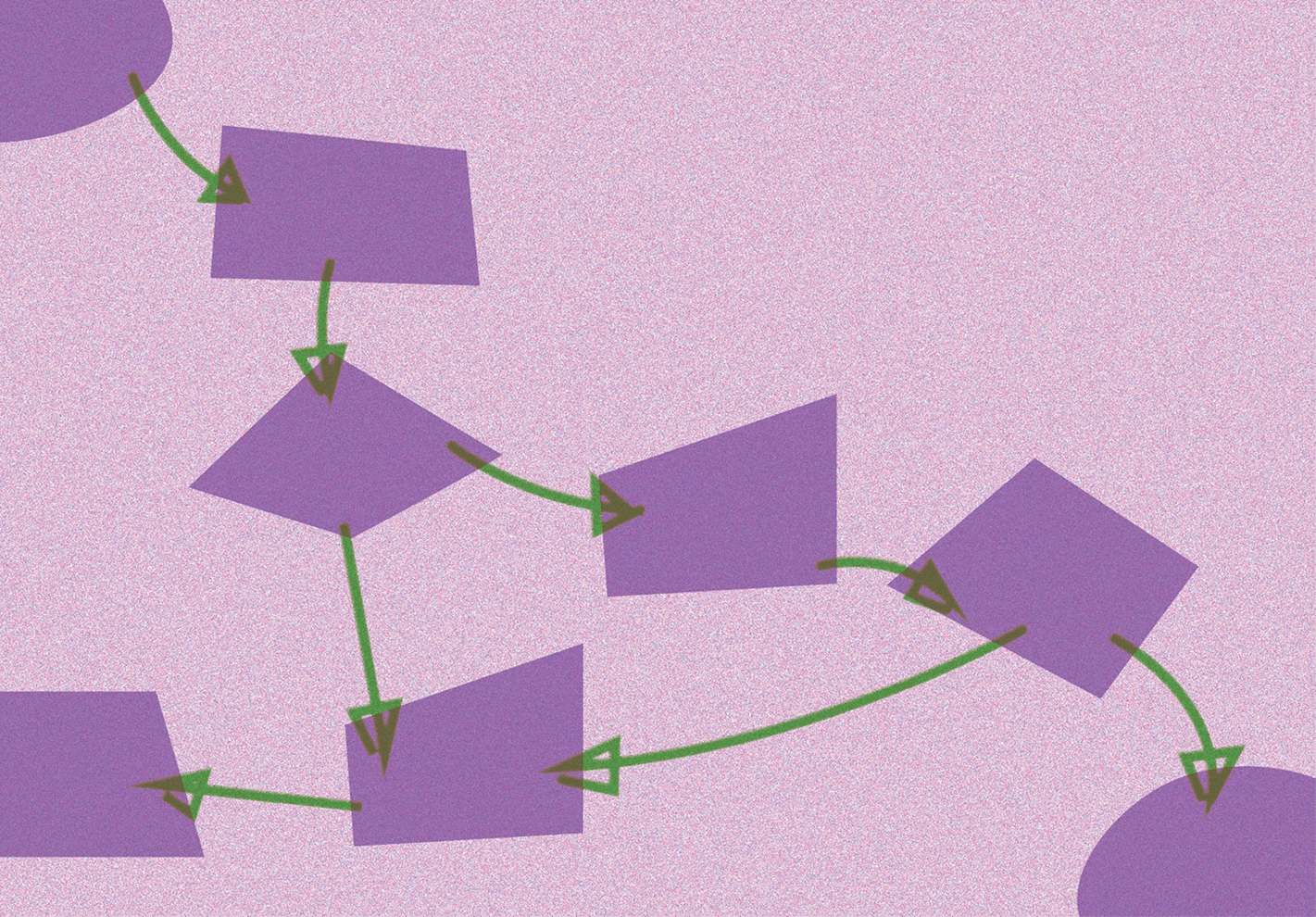
Rather than saying "we invest in growth," the IA gives that claim its own URL and builds the evidence there. The depth was deliberate - comprehensive, navigable information is itself a trust signal for a research-oriented audience.
Design
We Sketched Two Directions Before We Knew Which One Was Right.
Wireframing came before the brand direction was locked. We produced two sets of layouts - one leaning Kiki, one leaning Bobo - to give the perception research something concrete to react to.
Kiki leaned consulting-first: sharper, more structured, less warm. It communicated expertise but risked reinforcing the exact perception keeping promising Gen Z candidates from applying.
Bobo leaned people-first: warmer, friendlier, more expressive. It aligned better with Talemy's actual culture but needed enough structure to avoid reading as immature.
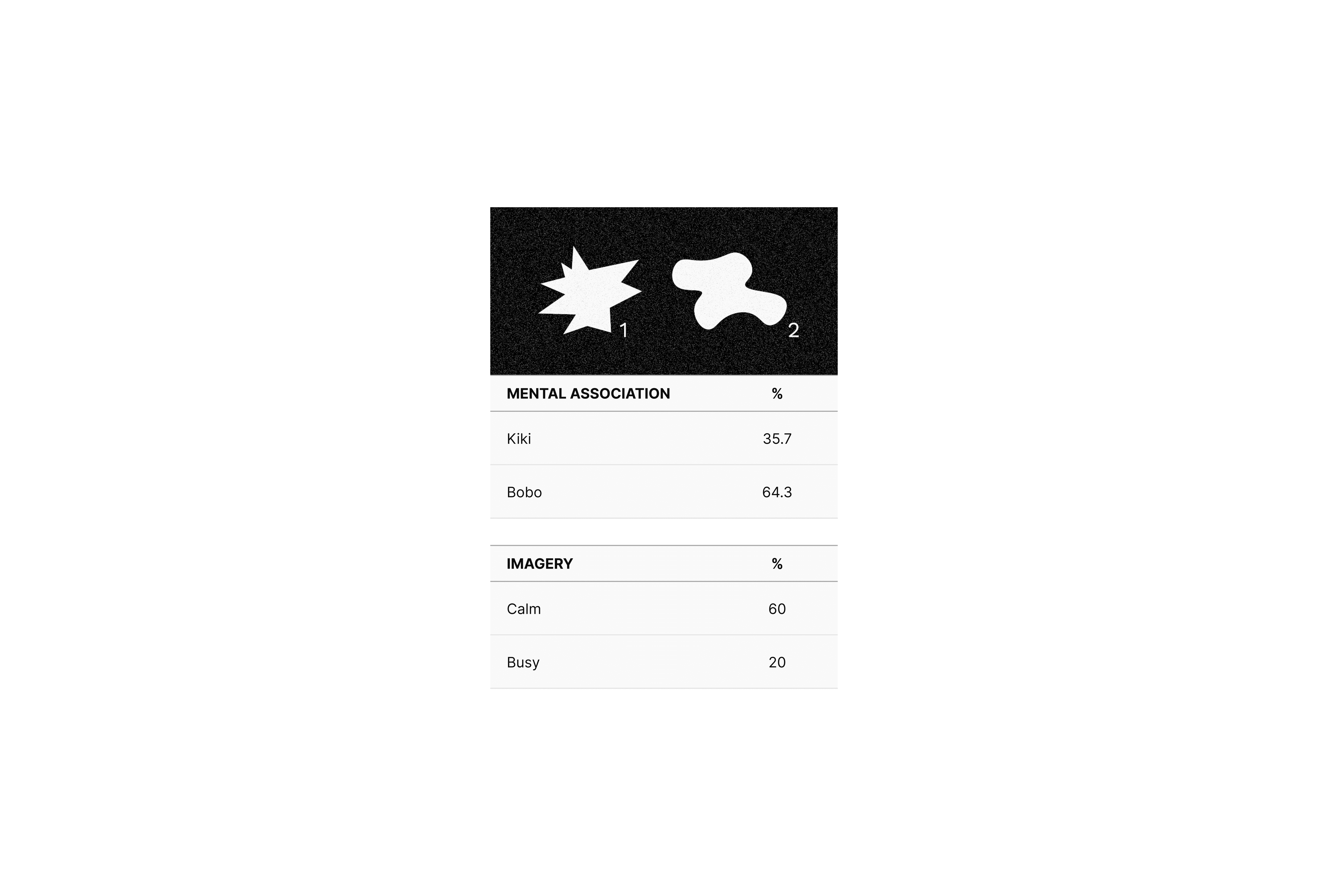
To decide between them, we ran a quick brand perception survey across clients, internal employees, and external entrepreneurs - asking how they perceived Talemy as a brand. The results landed clearly in the Bobo quadrant. We moved forward with that direction, using rounded corners, warm tones, and expressive typography while keeping enough visual discipline to maintain credibility.
The main shift between the two wireframe rounds was how much visual weight images carried versus text. The first round was more text-heavy. The second pulled images forward as primary content - not for aesthetic reasons, but because the research showed Gen Z processes visuals as evidence. A page that opens with real photos of the team carries more trust than one that opens with a paragraph about culture.
The main shift between the two wireframe rounds was how much visual weight images carried versus text. The first round was more text-heavy. The second pulled images forward as primary content - not for aesthetic reasons, but because the research showed Gen Z processes visuals as evidence. A page that opens with real photos of the team carries more trust than one that opens with a paragraph about culture.
Most career pages follow this layout:
Introduction - context for the page
What we do - the claim
How we do it - the mechanism
Here's the proof - examples, images, stories
Call to action - an invitation to apply or explore further
For the benefits page specifically, a downloadable PDF overview was added so candidates could save and review the full package independently - transparency around benefits is an evaluated signal for Gen Z, not a courtesy.
Visual Language
Same Design System. More Life.
The career section uses the same UI components and core elements as the rest of the Talemy website, same design system, same tokens, same typography. The difference is in how the Dynamic mode of the brand is applied. Where the B2B services section is more restrained, the career section turns up the energy through a much heavier use of photography. More images, warmer, more candid, more expressive - that's what makes it feel different.
Key decisions
No stock photography anywhere in the career section
Brushstroke overlays on Taleminion portraits for job listing pages - approachable without losing brand edge
Warm tones and authentic expressions across all imagery
Copy voice in the witty-informative quadrant: "Become a Taleminion" not "We're hiring"
Content Production
The Nha Trang Trip Wasn't Just a Company Trip.
In June 2023, the full team traveled to Nha Trang for a company trip, where we also ran a customer journey workshop. The trip served a dual purpose - it was when a significant portion of the career section's visual content was produced.

For Gen Z, employer brand photography needs to capture genuine moments rather than polished corporate imagery. Photos from a real trip, showing how the team actually works and spends time together, carry more persuasive weight than any copy. The gallery and proof sections across the site drew heavily from this documentation.
The photoshoot established a two-tier visual system:
Professional headshots
branded polo shirts, genuine expressions, soft neutral backdrop; used for team and profile contexts
Casual documentation
warmer tones, unfiltered moments, vintage-style treatments; used for culture and activity content
Outcomes
What We'd Do Differently.
/teams and /learning were designed but not published at launch - these were the pages most directly tied to what Gen Z prioritises around development and growth, and their absence was a real gap in the proof system. They should have been prioritised in the content production schedule regardless of timeline pressure. The career blog also needed more lead time. Content production at that quality requires dedicated resourcing that wasn't scoped early enough. The structural decision was right; the planning wasn't.
Reflection
Employer Brand Is a Design Problem, Not Just a Marketing One.
Research findings directly shaped the IA. The IA shaped the page architecture. The page architecture shaped every visual and content decision downstream. The Gen Z skepticism insight wasn't a positioning note - it was a structural requirement. Building a proof system rather than a marketing page was the core design decision, and everything else followed from it.